Recent: Dead Fish Hand Colettes Pets Thermometer Reading List 2025 Tamper Resistant Claire Multibus Leek and Annatto New Book Repointing Ansel Adams Ubik Fashion Nautilus Shard Betty Boop Dance Reading List 2024 Ready for 2025 Shuttle Computer Abstract Arcs Election Night |
I like using chop saws and milling machines, hate using circular saws.
(In some way I think this also relates to the fact that I like
CLI's over GUI's, mail over chat, batch mode over interactive, etc.
I just don't do realtime.)
Where this really leads to is that I do graphic design in
Postscript
and edit video in
C.
People generally think of Postscript as being a printer-control protocol
(if they remember it at all, at this point). However, it is actually a
full programming language. It was
Adobe's
first product, and a direct descendant of earlier experiments by the
founders that can be traced back to
John Warnock's
"Design System" language at
Evans & Sutherland
which he extended with
Martin Newell
after moving to
Xerox PARC into
the
"JaM" language which then merged with an earlier PARC system into
the
InterPess system.
Warnock eventually left Xerox along with
Chuck Geschke
and founded Adobe on their next-generation, simplified version,
Postscript. Their first major customer was
Apple
and that kicked off the desktop publishing revolution.
There's a fantastic
usenet posting
on the details of Postscript and InterPess history by
Brian Reid.
Here's a tiny example of some Postscript code:
The biggest difference people used to markup languages like
TeX
or
HTML
find with Postscript is that it is not based on text with some
hints towards layout, but based entirely on geometric objects, of
which text is one particular type.
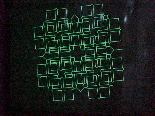
I dabbled in algorithmic graphics earlier, mostly
initiator-generator fractals
output to
Tektronics
storage tube
vector graphics terminals:
But I didn't get serious about art until I started making flyers for local
shows in Postscript.
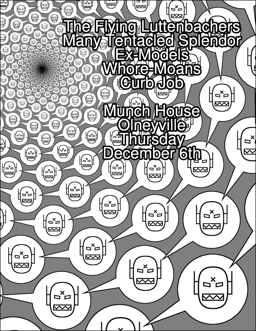
(
The Flying Luttenbacher's
logo was a perfect subject for me - that robot head was trivial to
recreate with basic geometric primitives, and then iterating it
along a spiral was simple in Postscript. A little sneaky
counter-rotating of the head versus the speach balloon, and it
was done. I had one copy printed out poster-sized. It looked great.)
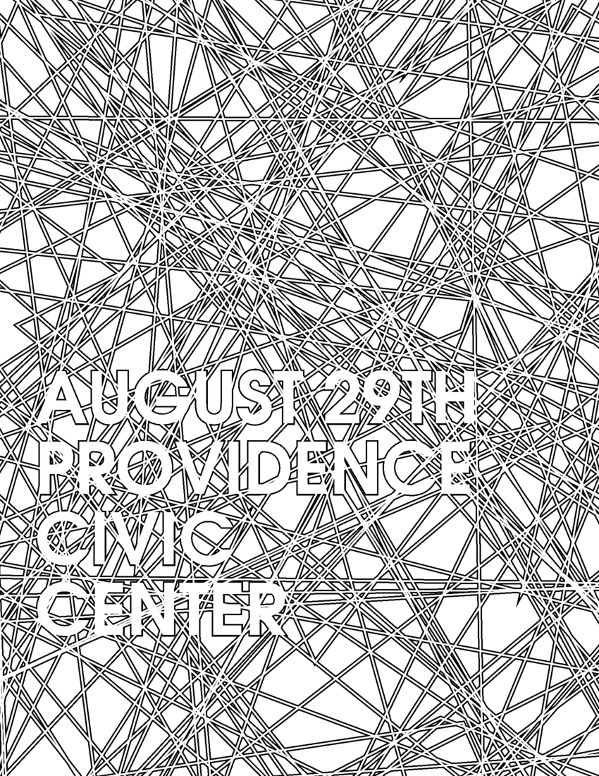
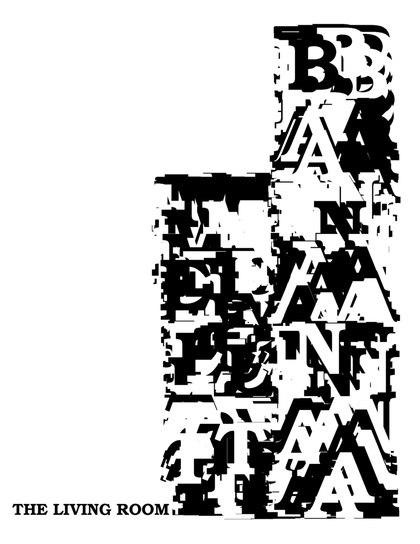
The flyers didn't necessarily have obvious mathy elements in them like
that robot-head-spiral. Some of them looked like perfectly normal
flyers - I just like laying out design like that by typing numbers and
code, instead of using something like Illustrator.
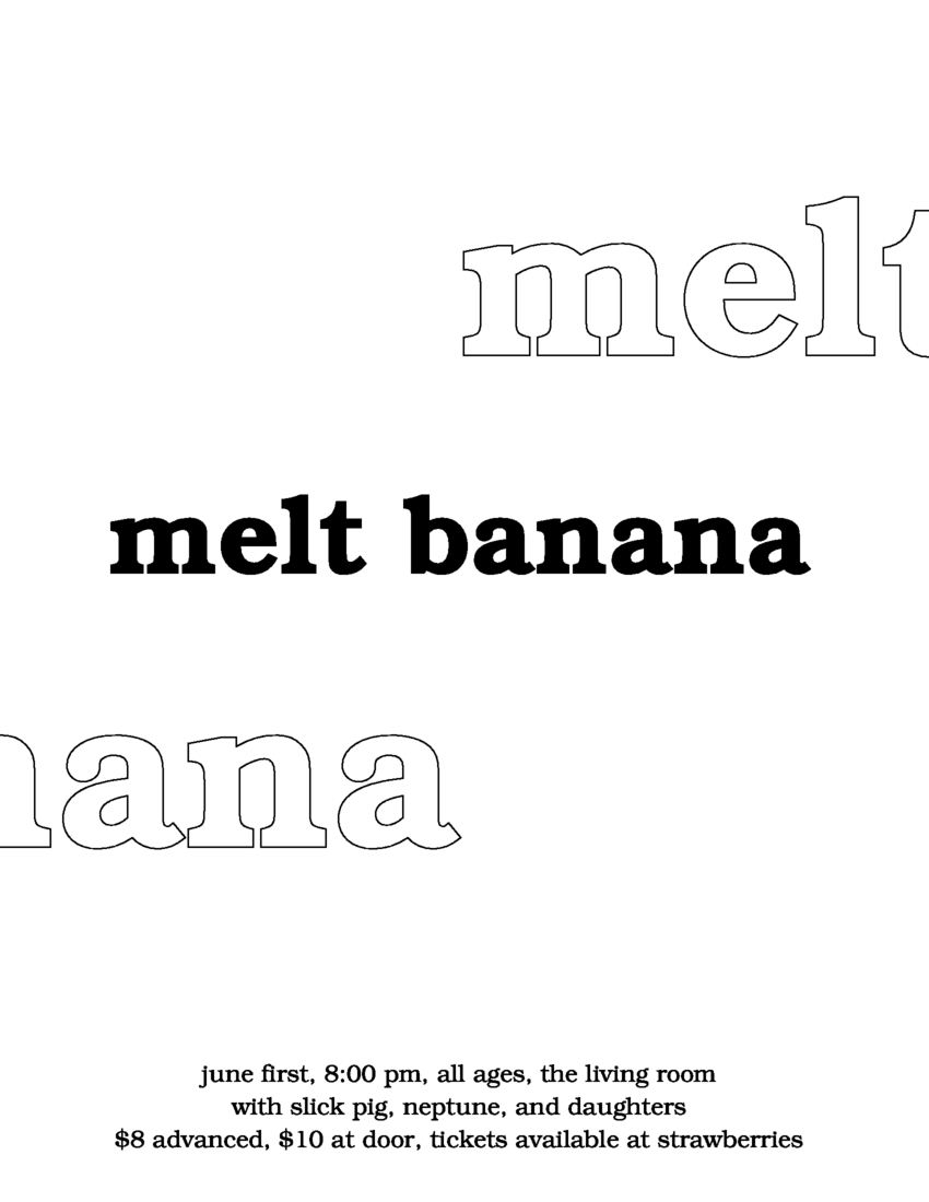
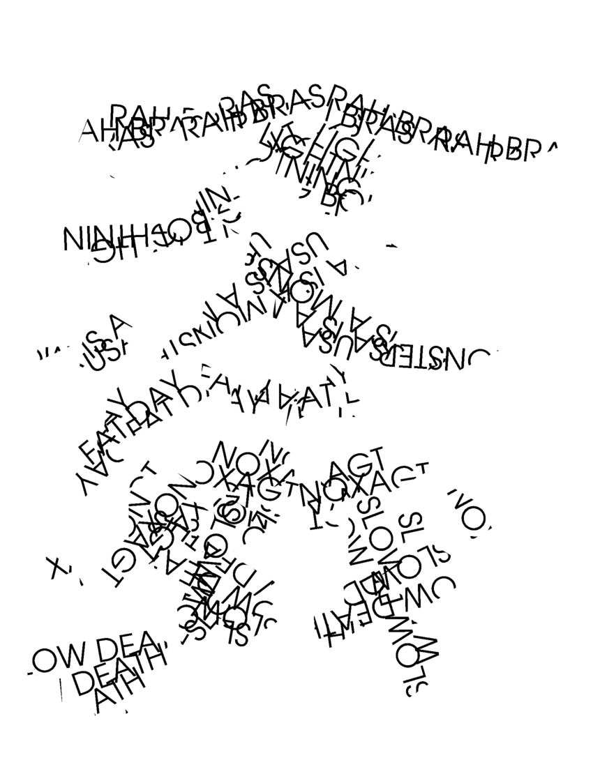
As web access became widespread, I decided that flyers
only needed to remind people about a show. They would find all the
details online (the people interested in these shows were from a
very small, tight-knit community), so I really didn't need to put
much info on the flyer itself:
This particular flyer however, because of the chopped
up typography, resulted in a rumour that
Arab on Radar
had reformed, because someone misread the
Rah Bras
part. Ha ha ha. Oops.
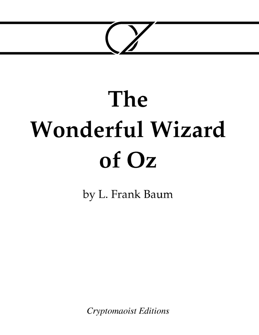
After that, I typeset a few books, as
Cryptomaoist Editions
(most notably, my edition of
Roadside Picnic has proven to be very popular),
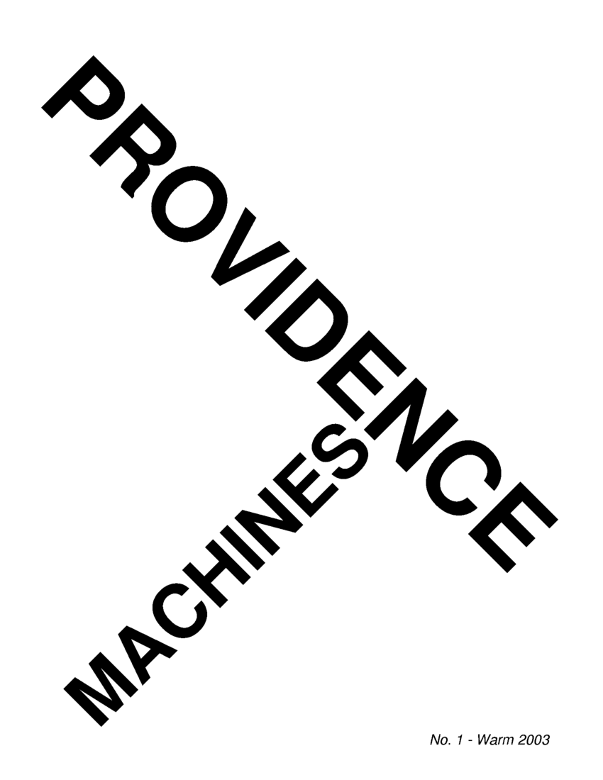
and did a four-issue zine called
Providence Machines.
I did a few Oz books purely because I wanted to do a Futurist
style Oz logo:
Providence Machines was inspired by my growing fascination
with the
Italian Futurist
movement, and
Fortunato Depero
in particular.
|